Sep 23, 2009

Monitor Mathematica computation with email

One of the new features in Mathematica 7.0 is allowing the sending of email directly from  any Mathematica program. It turns out very convenient for the certain situation. We have some computation tasks take long time to finish, so we  let it run on the server. The problem is that once a while I have to ssh to the server to check the outputs to make sure nothing wrong with the computation. Now with the email function, I can get the update immediately for each computation step. This is really helpful, especially now days you can check the email almost everywhere.

Picture 1

If you don’t need to check the detail, sending the update through the twitter is probably more cool.

One thing I am not sure is that how to catch the error. If there is an error raised during the computation, the math kernel can automatically send out the email with the error message, this function will be perfect.

By the way, this week I am working on an algorithm related with the Traveling Salesman Problem. If you check TSP on MathWolrd, download the notebook, you will notice it is created by a newer version of Mathematica. Open the file with any text editor, you will see:

(* CreatedBy='Mathematica 8.0' *).

Aug 25, 2009

Visualize irrational number as random walk

Irrational numbers have decimal expansions that neither terminate nor become periodic. So we can get unlimited “random walk” steps from an irrational numbers.

With the following code, the first 10000 digits of Sqrt[2] is presented as a random walk by converting it in base 4. 0, 1, 2 and 3 digit in base 4 represent 4 directions. Starting point is the green dot, the red one is the ending point.

x = N[Sqrt[2], 10000];
walk = First@ RealDigits[x, 4];
rn = FoldList[Plus, {0, 0}, {{0, 1}, {1, 0}, {0, -1}, {-1, 0}}[[# + 1]] & /@ walk];
Graphics[{Line[rn], PointSize[Large], Green, Point[First@rn], Red, Point[Last@rn]}]

randomwalk1

We can also display it with ArrayPlot by constructing a sparse array.

(* shift the moves to {1,1} *)

minx = Min[rn[[All, 1]]];
miny = Min[rn[[All, 2]]];
m = # + {-minx + 1, -miny + 1} & /@ rn;

(* sparse array *)

tt = Tally[m];
cd = SparseArray[tt[[All, 1]] -> tt[[All, 2]]];
cd = Transpose[cd];
ArrayPlot[cd, ColorFunction -> "Rainbow", DataReversed -> True, ColorRules -> {0 -> White}]

randomwalk2

Let’s visualize Sqrt[2], e, Pi in their first 50000 digits. It seems there are some similarities among these images.

Sqrt[2]

2

Pi

Pi

e

e

Update:

DrMajorBob said... in comments:

Here's a 3D version:

x = N[Sqrt[2], 10000];
walk = First@RealDigits[x, 6];
rn = FoldList[ Plus, {0, 0, 0}, {{0, 1, 0}, {1, 0, 0}, {0, -1, 0}, {-1, 0, 0}, {0, 0, 1}, {0, 0, -1}}[[# + 1]] & /@ walk ];
Graphics3D[{Line[rn], PointSize[Large], Green, Point[First@rn], Red, Point[Last@rn]}]


3d

You can also try non-irrational number, e.g. 121/5^10

Thanks.

Update 2:

Visualize genome sequence. I know nothing about it, it probably totally meaningless.

GenePlot[g_] := Module[{cs, rn}, walk = Characters[GenomeData [g, "FullSequence"]] /. {"A" -> 1,  "T" -> 2, "G" -> 3, "C" -> 4};
  rn = FoldList[Plus, {0, 0}, {{0, 1}, {1, 0}, {0, -1}, {-1, 0}}[[#]] & /@ walk];
  Graphics[{Line[rn], PointSize[Large], Green, Point[First@rn], Red, Point[Last@rn]}, Frame -> True, FrameTicks -> None] ]

GenePlot["DDK4"]

geneplot

GenePlot["DKK3"]

geneplot2

Aug 12, 2009

Display a plot by clicking a button

Ok, this seems to be very easy in Mathematica.

Button["Show me a plot", Show[Plot[Sin[x], {x, -Pi, Pi}]]]

Then you click the button, nothing happens.

Button["Show me a plot", Print[Plot[Sin[x], {x, -Pi, Pi}]]]

This line will do the job. Or use the following line:

Show[Plot[Sin[x], {x, -Pi, Pi}],
DisplayFunction -> (Button["Show me a plot", Print[#]] &)]

The key here is to use “Print” rather than “Show”. It isn’t clearly explained in the “ref/Button”.

Aug 7, 2009

View weighted graph with GraphPlot

Here is a simple example on how to customizing Graphplot. We like to use GraphPlot to visualize the number of people who commute into or out Monroe county from/to its neighbor counties.

g={{"Owen" -> "Monroe", 2813}, {"Greene" -> "Monroe",
  3788}, {"Lawrence" -> "Monroe", 4022}, {"Jackson" -> "Monroe",
  85}, {"Brown" -> "Monroe", 689}, {"Morgan" -> "Monroe",
  821}, {"Monroe" -> "Owen", 676}, {"Monroe" -> "Greene",
  207}, {"Monroe" -> "Lawrence", 679}, {"Monroe" -> "Brown",
  303}, {"Monroe" -> "Morgan", 617}}

vercoor={"Monroe" -> {-86.529, 39.1621}, "Owen" -> {-86.7642, 39.2868}, "Greene" -> {-86.9403, 39.0246},  "Lawrence" –> {  -86.4923,  38.8627}, "Jackson" -> {-86.0462, 38.8798},  "Brown" -> {-86.2382, 39.203}, "Morgan" -> {-86.4238, 39.4233}}

First try:

GraphPlot[g, VertexLabeling -> True, VertexCoordinateRules -> vercoor]

graphplot1

Using arrow to indicate in/out seems to be a good idea. We use EdgeRenderingFunction in second try:

GraphPlot[g, VertexLabeling -> True,
EdgeRenderingFunction -> (Arrow[#1, 0.05] &),
VertexCoordinateRules -> vercoor]

graphplot2

However, the labels on the edge is lost. We can handle it in EdgeRenderingFunction.

GraphPlot[g, VertexLabeling -> True,
EdgeRenderingFunction -> ({Text[#3, Mean[#1]], Arrow[#1, 0.05]} &),  VertexCoordinateRules -> vercoor]

graphplot3

The graph is still difficult to read, the commuting pattern isn’t clear at a glance. We further update EdgeRenderingFunction and use the line color and thickness to show the pattern.

GraphPlot[g,
EdgeRenderingFunction -> ({If[#2[[1]] == "Monroe", Red, Blue],
     AbsoluteThickness[0.5 + #3/500], Arrowheads[0.02 + #3/120000],  Arrow[#1, 0.05]} &), VertexLabeling -> True,
VertexCoordinateRules -> vercoor]

graphplot4

In the last try, we use VertexRenderingFunction to make the label more clear.

GraphPlot[g,
EdgeRenderingFunction -> ({If[#2[[1]] == "Monroe", Red, Blue],
     AbsoluteThickness[0.5 + #3/500], Arrowheads[0.02 + #3/120000], Arrow[#1, 0.06]} &), VertexLabeling -> True,
VertexCoordinateRules -> vercoor,
VertexRenderingFunction -> ({Text[Style[#2, 14, Bold], #2 /. vercoor, Background -> White]} &)]

graphplot5

Import the shapefile, then you get a map:

graphplot6

Jul 29, 2009

View stock market seasonality

A reader asks about the seasonal chart. Here is a simpler version.

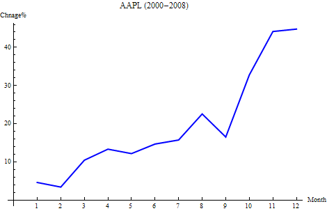
The seasonality is defined as the percent change from the beginning of year to the end of each month.

monthlychange[stock_, year_] :=
Module[{data, firstdateprice, endofmonthprice},
  data = FinancialData[stock, "Close", {{year, 1, 1}, {year, 12, 31}}];
  data = Map[Flatten[#] &, data]; firstdateprice = data[[1, 4]];
  endofmonthprice = Table[Last@Select[data, #[[2]] == i &][[All, 4]], {i, 12}]; (endofmonthprice/firstdateprice - 1)*100]

This will give you the monthly change of AAPL in the year of 2008.

monthlychange["AAPL", 2008]

For multiple years, the average seasonality:

mc = monthlychange["AAPL", #] & /@ Range[2000, 2008];

Mean@mc

For APPL, the following graph shows the average seasonality from 2000 – 2008. According to this graph, it is probably a good idea to hold the stock through Oct and Nov before selling it.

seasonality

This is a graph shows the seasonality year by year.

seasonality2