The main change is that FinancialData now returns a TimeSeries object.
 I haven't touched Mathematica 10,11 and 12, learning 13 on Wolfram Cloud
right now. Mathematica has changed a lot!!
I haven't touched Mathematica 10,11 and 12, learning 13 on Wolfram Cloud
right now. Mathematica has changed a lot!!
A reader asks about the seasonal chart. Here is a simpler version.
The seasonality is defined as the percent change from the beginning of year to the end of each month.
monthlychange[stock_, year_] :=
Module[{data, firstdateprice, endofmonthprice},
data = FinancialData[stock, "Close", {{year, 1, 1}, {year, 12, 31}}];
data = Map[Flatten[#] &, data]; firstdateprice = data[[1, 4]];
endofmonthprice = Table[Last@Select[data, #[[2]] == i &][[All, 4]], {i, 12}]; (endofmonthprice/firstdateprice - 1)*100]
This will give you the monthly change of AAPL in the year of 2008.
monthlychange["AAPL", 2008]
For multiple years, the average seasonality:
mc = monthlychange["AAPL", #] & /@ Range[2000, 2008];
Mean@mc
For APPL, the following graph shows the average seasonality from 2000 – 2008. According to this graph, it is probably a good idea to hold the stock through Oct and Nov before selling it.
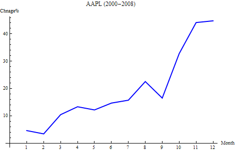
This is a graph shows the seasonality year by year.
There is a heatmap tool which let you view the stock price change at a glance. It can be recreated with Mathematica in several lines of code.
Let’s pull the data by format {“symbol”, price change}
stockdata={#,(FinancialData[#]/FinancialData[#,"Close"]-1)*100 }& /@FinancialData["^DJI","Members"];
Then we need to represent the price change by color: Green means up, Red mean down, and the deeper the color, the bigger the change.
max = Max[Abs[stockdata[[All, 2]]]]; (* max change *)
GraphicsGrid[Partition[Graphics[{If[#[[2]]>=0.0,Blend[{White,Green},Rescale[#[[2]], {0,max}]], Blend[{Red,White}, Rescale[#[[2]],{-max,0}]]], Rectangle[], Black,Text[Style[#[[1]]<>"\n"<>ToString[NumberForm[#[[2]],{3,2}]]<>"%", Medium,Bold], {0.5,0.5}]}] &/@ stockdata, 6 ]]
The key function is if the price change is >0, then rescale the change in range (0, max) and get it’s color in Blend[{White, Green}]; if the price change is <0, then rescale the change in range (-max, 0) and use Blend[{Red, White}] to get the right color.

In the ascending order:
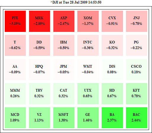
We can try other representations, too. For example, we can use the size of disk to represent the change.
Technologically speaking, Apple and Microsoft are two quite different companies in many ways. We all know that in recently several years, Apple stock is very hot. Here is the stock price: APPL vs MSFT since 2004, the legend is not necessary for this graph.
DateListPlot[{FinancialData["AAPL",{2004}], FinancialData["MSFT",{2004}]}, Joined->True, Filling->Bottom]

Google Insights for Search gives another way to present it.
Google search volume index for "AAPL" since 2004

Google search volume index for "MSFT" since 2004


900/FinancialData["USD/JPY"] gives $8.42, it is around 60% more expensive than the ones you can get here, however, it must taste much better.
One interesting thing is how much we can get if we convert 1 USD dollar to Japan Yen through the third currency. NASDAQ January Performance (1991~2006)

