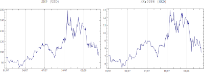
Fro example, China Petro & Chem is traded in both US and HK stock markets. The price between these two markets are different, it seems US price follows the movements of HK's in recent several months.

After converting HK share price to US dollars, the price differences can be shown:
DateListPlot[{ussnp, hksnp}, Joined -> True, Filling -> {1 -> {2}}, FillingStyle -> {Green, Red}, DateTicksFormat -> {"Month", "/", "YearShort"}]
The trick is to use Filling -> {1 -> {2}}, FillingStyle -> {Green, Red}, Green indicates HK price is higher than US price, the red means the opposite.

No comments:
Post a Comment