Aug 25, 2010

Work with Web Map Service (WMS)

Web Map Service (WMS) is is a standard protocol for serving geo-referenced map images over the Internet. JPL OneEarth is used as the data source here.

All the datasets that exist on OneEarth server are documented for WMS clients in an XML Capabilities file, which contains information about the layers, which correspond to datasets, and the styles associated with them.

The base url is http://wms.jpl.nasa.gov/wms.cgi?, to request the image, some parameters are required: layers, srs, width, height, bbox, format, styles. Click the following url, it returns an satellite image from Blue Marble Next Generation, a MODIS-derived 500m true color earth dataset showing seasonal dynamics. styles is used to specify the month. Check OneEarth website for the details.

http://wms.jpl.nasa.gov/wms.cgi?REQUEST=GetMap&layers=BMNG&srs=EPSG:4326&width=300&height=300&bbox=112,-44,154,-10&format=image/jpeg&styles=Jan

In Mathematica, image is imported with Import[wms_url]. However, once the image is imported, it loses the geo-reference information, and we need move the image back to its right position (bbox parameter).

The trick is using Raster function to convert image to a graphic object with the right coordinates.

raster = Raster[Reverse[ImageData[img]], {{112, -44}, {154, -10}}];

image

I borrow the example from this weatherdata blog entry.

image2

The imported image works perfectly with the data from Mathematica.

Mathematica Notebook: wmsimage.nb

Aug 20, 2010

Visualize weather pattern with random walk

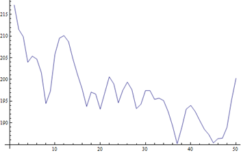
When talking about the “good” weather, the daily temperature change is important, slow steady change from day to day is much better than sudden temperature increase or drop.

Here is the daily mean temperature for Bloomington, Indiana.

bloomington

We define a piecewise function to classify the day to day temperature change. x is (T – Tprevious day), y is the threshold to define the weather change: 1 ~ no change, 2 ~ cold move, 3 ~ mild cold, 4 ~ mild hot, 5 ~ hot move.

piecewise

Then we can apply the same random walk trick used in the post Visualize irrational number as random walk. The classification results are mapped into the moves: 1 ~ no move {0, 0}, 2 ~ move south {0, –1}, 2 ~ move west {-1, 0}, 3 ~ move east {1, 0}, 4 ~ move north {0, 1}. Then we can get a random walk image (the green dot is starting point {0, 0}, the red one is the end).

bloomingtonwalk

This is probably nothing interesting. However, we can use it to compare the patterns among different cities. Here is the results from Washington, Columbus, Indianapolis, Kansas City, Denver. The threshold is 3.5 degree. This shows the certain pattern among cities from ocean to inland.

cities

When we compare the cities across the ocean, a different pattern is shown.

cities2

Down the weatherwalk.nb for the detail.

Apr 19, 2010

Play with Bibliographic Data

I’ve got the publication list of a research institute. There are more than 1400 entries, exported in xml format from Endnote. As a data mining project, there are plenty of things you can do with the data. Let’s assume  we are interested in the relationships among researchers and groups. Can we check this out quickly in Mathematica?

First, extract the data:

in the xml, for each publication, the author list is stored as the following:

<authors>
<author>
  <style face="normal" font="default" size="100%">Paul, N.</style>
</author>
<author>
  <style face="normal" font="default" size="100%">Cao, B.</style>
</author>
… </authors>

xml = Import["Bib.xml"];

authors = Cases[xml, XMLElement["authors", _, authors_] -> authors, Infinity];

names = Flatten@Cases[#, XMLElement["author", _, {___, XMLElement["style", _, name_]}] –> name] & /@ authors;

What we get here is the lists of authors for each publication.

Let’ see the relationship between number of authors and number of publications.

Sort[Tally[Length[#] & /@ names], #1[[1]] < #2[[1]] &]

{{1, 265}, {2, 280}, {3, 320}, {4, 224}, {5, 94}, {6, 85}, {7,
  39}, {8, 22}, {9, 20}, {10, 14}, {11, 11}, {12, 14}, {13, 5}, {14,
  3}, {15, 5}, {18, 1}, {19, 1}, {20, 1}}

xml

We can see that most of publications have no more than 4 authors.

Next step, we like to check out the internal relationships among authors. We need to generate a network for authors. For example, if a publication has 4 authors {A, B, C, D}, the network is defined as a circle:

Flatten@(Partition[Append[authors, authors[[1]]], 2, 1] /. {x_, y_} :> {x -> y})

{A -> B, B -> C, C -> D, D -> A}

For all the publications, we get the following network:

xml2

There are two large research groups inside this institute. Then re-draw the graph with top 10 contributors, it confirms the information.

xml3

No too bad with 10 minutes coding.

I will not release the notebook this time, since I may not have the right to distribute the data. Sorry about it.

Mar 25, 2010

Extract elevation data with Google Elevation Service

In the previous post: Extract elevation data from Google Earth, Google Earth COM API is used, it only works on Windows platform. Google Map now has Elevation Web Service, it is quite easy to do it with new API. The new service does not require a Maps API key. The basic form is

“http://maps.google.com/maps/api/elevation/outputFormat?parameters”

For output format, 

  • /json returns results in JavaScript Object Notation (JSON).
  • /xml returns results in XML, wrapped within a <ElevationResponse> node.

JSON is easy to parse, this is a sample query:
json=Import["http://maps.google.com/maps/api/elevation/json?locations=39.7391536,-104.9847034&sensor=false"]

{
  "status": "OK",
  "results": [ {
    "location": {
      "lat": 39.7391536,
      "lng": -104.9847034
    },
    "elevation": 1608.8402100
  } ]
}


ToExpression@StringCases[json, NumberString]


{39.7392,-104.985,1608.84}


Here is the example output:


GoogleEvelvationService0


Path elevation example:


GoogleEvelvationService


DEM + Path:


GoogleEvelvationService2


Grab the GoogleElevationService.nb for detail.


Update: answer the comments


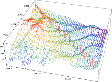
You may have the trouble with the notebook. Sometimes ListPlot3D runs too slow and even crashes Mathematica. You can switch to ListPlotPoint3D.


ListPointPlot3D[dem[[All, {2, 1, 3}]], ColorFunction -> "Rainbow"]


Here is the example with 100 by 100 DEM.


GoogleElevationService

Jan 26, 2010

More on Heatmap

A reader asks about this heatmap post on Flowing Data. Sure, we can do it easily with ArrayPlot. Grab the notebook here.

data = Import["ppg2008.csv"];

Grid[data]

Capture 

numbers = data[[2 ;; All, 2 ;; All]]; (* this is the data for heatmap *)
playernames = data[[2 ;; All, 1]]; (* for the labels *)
statnames = data[[1, 2 ;; All]]; (* for the labels *)

Then we need to scale the each column separately to [0,1].

newnumber = Transpose[Rescale[#] & /@ (Transpose[numbers])];

Then you can generate a simple heatmap simply by ArrayPlot[newnumber].

Of course, we like to add the labels with FrameTicks option. FrameTicks->{{left,right},{bottom,top}}  mark options specified separately for each edge. 

Transpose[{Range[Length[playernames]], playernames}] generate the list {{1, “player1”} … {50, “player50”}} to label the player names.

Transpose[{Range[Length[statnames]], Map[Rotate[#, 60 Degree] &, statnames]}] with this line, we can rotate the labels at the same time.

Here is the final product, click to see the full graphic.

NBAHeatmap