Showing posts with label Image. Show all posts

Jan 26, 2023

ImageStitch, aerial photos and a surprise

Aerial photos are usually taken with overlaps, it is a perfect application for ImageStitch to generate a mosaic of the aerial photos from one flight line.

First, let's import the photos from FlightLine 3196it is somewhere in Antarctica. The data is from the Center for Remote Sensing and Integrated Systems (CReSIS). 

There are 12 images:

Then run ImageStitch on the imported images, on Mathematica 13.0.1, the result is the following, clearly something wrong.


For the reference, the image from Google Earth, 

The plan was to extend the function from the previous post on ImageStitch, we only need a function to work with two images, then we can use Fold function to apply it incrementally over all the images, since the photos are taken in a sequence, for example:

imagelist = {image1, image2, image3, imaga4};

Fold[ourimagestitch[#1, #2] & , imagelist[[1]], imagelist[[2 ;;]]] 

===>

ourimagestitch[ourimagestitch[ourimagestitch[image1, image2], image3], imaga4] 

 A Surprise

Mathematica 13.2 is out, ImageStitch function is updated. Our organization only has the license for 13.0.x version right now. So, I downloaded Mathematica Engine 13.2, run the same code in Jupyter Notebook, the result is great.


Kudos to the developer!

Jupyter Notebook: ImageStitch and Aerial Photos


May 11, 2011

Fun with Texture

Texture support is one major improvement in Mathematica 8.0. Sure, we can have some fun with it. Here is an example. We draw some polygons first.

animalcorssing2

Then some textures are applied, we get the following image. The main trick is to use alpha channel to get this cut-out texture mapping effect. The original tree image has the alpha channel already, we can use it directly, Texture[ImageData[tree]] will do the trick, if you use Texture[tree], somehow it will not pick up the alpha channel. For the character image, it doesn’t has the alpha channel, we can set a alpha channel by the following command:

SetAlphaChannel[im,
ChanVeseBinarize[ColorNegate@im] // FillingTransform ]

animalcorssing

By the way, the character is Tom Nook: "This isn't fat, I've just lined my insides with money."

Download the notebook.

May 9, 2011

Top 10 Box Office Movies Wallpaper Generator

I saw a script IMPloader that fetches the posters for the top 10 Box Office movies of the week from http://www.impawards.com/, and automatically generates a wallpaper, it is requires Ruby, imagemagick and wget. If you are running Window, you probably don’t want to install these packages. We can do it with Mathematica with ImageAssemble and ImagePad functions introduced in 8.0.

movieposters_code

movieposters

Download the notebook: movieposters.nb

Apr 26, 2011

Visualize underground structures with texture mapping

The Center for Remote Sensing of Ice Sheets (CReSIS) has many radar images which show underground ice bed elevations both in north pole and south pole regions.

In the following image, the red line marks the ice bed underground (6000 actually means 6000 m under the earth surface). Radar signal is acquired from the plane, each image has the flight path information (red line in the second image).

20091228_02_014_061152_2echo_picks

20091228_02_014_061152_0maps

The task here is to combine flight path and radar image to display 3D underground information directly. It can be achieved in the following two steps with Mathematica 8’s texture support:

f = BSplineFunction[flightpath]; (* flight path {{x1,y1}, ..{xn, yn}} *)

ParametricPlot3D[Flatten@{f[x], z}, {x, 0, 1}, {z, -6000, 1000},
BoxRatios -> 1, BoundaryStyle -> Green, Mesh -> None, Axes -> None,
PlotStyle -> {Texture[radarimage]}, Lighting -> "Neutral", ImageSize -> 600]

viewtexture

The radar image has to be cropped in advance, and we only keep part as deep as 6000 meters. There are some rough parts on the image, especially close to the boundaries (check out the update for the solution), the general quality is good enough. We can make the same thing for another radar image, then put them together, make the following product to show the intersection. It is not perfect solution, however, it is nice to have something in just several lines. 

viewtexture3

No notebook this time.

Updates: Someone asks how to get rid of zig-zag boundaries.

It can be done with two options, one is PlotPoints, the other MaxRecursion, check the ParameterPlot3D documentation for the details.

For example,  MaxRecursion –> 4

viewtexture

Mar 14, 2011

Dec 21, 2010

Happy Holiday!

Happy Holiday!

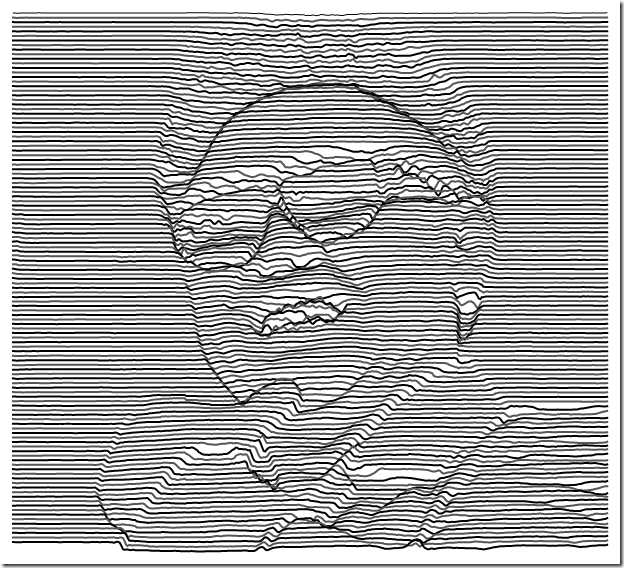
imagelineofart

Be a nice person in 2011, everyone will be happy.

How to generate this image?

First, find an image, then

img2 = ColorConvert[img, "HSB"];
img3 = ImageData[img2][[All, All, 3]];
ListPlot[Table[img3[[i]]*10 - i, {i, 1, ImageDimensions[img][[2]], 3}],
PlotRange -> All, Axes -> None, Joined -> True, PlotStyle -> {{Black}, {Thick, Lighter[Black]}}, AspectRatio -> ImageAspectRatio[img]]

Nov 15, 2010

Color-coded contour lines with Mathematica

In ContourPlot, ContourStyle –> function can be used to color-code contour lines.For example, the number of contours is numC=20, then for each contour, the color is defined by a coloring function:

ContourStyle -> Table[{ColorData["Rainbow", (i - 1)/(numC - 1)]}, {i, numC}]

Of course, it is also necessary to set Contours –> numC.

Here are the examples, the famous peaks function from Matlab is used.

2D ContourPlot example:

colorcodedcontourlines

Turn 2D plot into the 3D one:

colorcodedcontourlines1

Another 3D example:

colorcodedcontourlines3

Download the notebook.

Nov 8, 2010

Customizing DateListPlot with PlotMarkers

This example shows you how to specific PlotMarkers for each point in a data set. The solution is quite simple, just partition the dataset into different series, each set only contains one point exactly: Partition[data, 1]. Then we can assign the different PlotMarkers for each point.

Let’s download some weather data:

data = WeatherData[$GeoLocation, "WindDirection", {{2009, 1, 1}, {2009, 1, 5}}];
data = Select[data, FreeQ[#, {_, Missing["NotAvailable"]}] &];

We like to use arrows to represent wind directions:

markers =
  Graphics[{Red, Arrow[{{0, 0}, -0.5 {Sin[#[[2]] Degree], Cos[#[[2]] Degree]}}],
      EdgeForm[], FaceForm[], Rectangle[{-1, -1}, {1, 1}]}] & /@ data;

We put a invisible box around arrow to make sure that the markers are aligned by {0, 0}.

newdata = data; newdata[[All, 2]] = 0;
g = DateListPlot[Partition[newdata, 1], PlotRange -> All, PlotMarkers -> markers, Axes -> {True, False}, FrameTicks -> {Automatic, None}]

1

Let’s test another place: Tokyo, Japan

Summer time:

customplotmarker 

Winter time:

customplotmarker1

The pattern of winter “north” wind and the summer “south” wind is very clear, it is much better than just plotting points.

No notebook, all the codes are here already.

Oct 26, 2010

Processing comic images for e-reader

First, this post probably falls into the category of “just because you can do it doesn’t mean you should” with Mathematica.

Here is the job: the comic is in cbz/cbr format, and images are too large for the e-reader usually with 800 by 600 resolutions (the actual usable space is even smaller). So you like to do three things with these images: 1.cut white margins, 2. resize, 3. increase contrast if image is not clear enough. It can be done with three Mathematica commands: ImageCrop, ImageResize and ImageAdjust.

One line example:

Export[#,
  ImageAdjust[
    ImageResize[
    ImageCrop[Import["test.cbz", {"ZIP", #}]], {584, 714}],
    0.2]] & /@ (Import["test.cbz", "ZIP"])

If it is in cbr format, it has to be unpacked first.

Actually under  the certain situation, this may come in handy. There are more and more comics in epub format made for iPad. And epub is basically a zip file contains html/css and images. The following line returns the image file names inside epub. 

Select[Import["test.epub","ZIP"], StringMatchQ[#,__~~".jpg", IgnoreCase->True]&]

Then the images can be changed into grayscale if necessary and re-formatted for e-reader. Just dump the images back into epub afterward.

Sep 29, 2010

Tips: Import MATLAB MAT-files

You want to import the “.mat” file:

Import[“Helheim.mat”]

Import::fmterr: Cannot import data as MAT format. >>

Don’t panic. Since the version 7.3 (2006b), Matlab actually saves mat files using the HDF5 format by default. So pretty much every mat file you work with nowadays is in HDF5 format. Let’s try it again.

Import["Helheim.mat", "HDF5"]

{"/Data", "/Depth", "/Distance", "/Latitude", "/Longitude",  "/UTC_time"}

data = Import["Helheim.mat", {"HDF5", "Datasets", "/Data"}];

Then we can generate a beautiful plot in Mathematica.

viewmat

For who may wonder what this image is, it is the radar image shows underground ice-thickness, more information can be found at The Center for Remote Sensing of Ice Sheets (CReSIS)

Aug 25, 2010

Work with Web Map Service (WMS)

Web Map Service (WMS) is is a standard protocol for serving geo-referenced map images over the Internet. JPL OneEarth is used as the data source here.

All the datasets that exist on OneEarth server are documented for WMS clients in an XML Capabilities file, which contains information about the layers, which correspond to datasets, and the styles associated with them.

The base url is http://wms.jpl.nasa.gov/wms.cgi?, to request the image, some parameters are required: layers, srs, width, height, bbox, format, styles. Click the following url, it returns an satellite image from Blue Marble Next Generation, a MODIS-derived 500m true color earth dataset showing seasonal dynamics. styles is used to specify the month. Check OneEarth website for the details.

http://wms.jpl.nasa.gov/wms.cgi?REQUEST=GetMap&layers=BMNG&srs=EPSG:4326&width=300&height=300&bbox=112,-44,154,-10&format=image/jpeg&styles=Jan

In Mathematica, image is imported with Import[wms_url]. However, once the image is imported, it loses the geo-reference information, and we need move the image back to its right position (bbox parameter).

The trick is using Raster function to convert image to a graphic object with the right coordinates.

raster = Raster[Reverse[ImageData[img]], {{112, -44}, {154, -10}}];

image

I borrow the example from this weatherdata blog entry.

image2

The imported image works perfectly with the data from Mathematica.

Mathematica Notebook: wmsimage.nb

Aug 20, 2010

Visualize weather pattern with random walk

When talking about the “good” weather, the daily temperature change is important, slow steady change from day to day is much better than sudden temperature increase or drop.

Here is the daily mean temperature for Bloomington, Indiana.

bloomington

We define a piecewise function to classify the day to day temperature change. x is (T – Tprevious day), y is the threshold to define the weather change: 1 ~ no change, 2 ~ cold move, 3 ~ mild cold, 4 ~ mild hot, 5 ~ hot move.

piecewise

Then we can apply the same random walk trick used in the post Visualize irrational number as random walk. The classification results are mapped into the moves: 1 ~ no move {0, 0}, 2 ~ move south {0, –1}, 2 ~ move west {-1, 0}, 3 ~ move east {1, 0}, 4 ~ move north {0, 1}. Then we can get a random walk image (the green dot is starting point {0, 0}, the red one is the end).

bloomingtonwalk

This is probably nothing interesting. However, we can use it to compare the patterns among different cities. Here is the results from Washington, Columbus, Indianapolis, Kansas City, Denver. The threshold is 3.5 degree. This shows the certain pattern among cities from ocean to inland.

cities

When we compare the cities across the ocean, a different pattern is shown.

cities2

Down the weatherwalk.nb for the detail.

Jan 26, 2010

More on Heatmap

A reader asks about this heatmap post on Flowing Data. Sure, we can do it easily with ArrayPlot. Grab the notebook here.

data = Import["ppg2008.csv"];

Grid[data]

Capture 

numbers = data[[2 ;; All, 2 ;; All]]; (* this is the data for heatmap *)
playernames = data[[2 ;; All, 1]]; (* for the labels *)
statnames = data[[1, 2 ;; All]]; (* for the labels *)

Then we need to scale the each column separately to [0,1].

newnumber = Transpose[Rescale[#] & /@ (Transpose[numbers])];

Then you can generate a simple heatmap simply by ArrayPlot[newnumber].

Of course, we like to add the labels with FrameTicks option. FrameTicks->{{left,right},{bottom,top}}  mark options specified separately for each edge. 

Transpose[{Range[Length[playernames]], playernames}] generate the list {{1, “player1”} … {50, “player50”}} to label the player names.

Transpose[{Range[Length[statnames]], Map[Rotate[#, 60 Degree] &, statnames]}] with this line, we can rotate the labels at the same time.

Here is the final product, click to see the full graphic.

NBAHeatmap

Jan 12, 2010

Charting time series as calendar heat maps

I haven’t updated this blog for a while. I am working on one Matlab project right now. It is kind of difficult for me to work with Matlab and Mathematica at the same time.

There is an interesting post Charting time series as calendar heat maps in R. The original idea from SAS Analysis of airline performance. I create a simple version in Mathematica. The tricky part is to generate the background grid.

yeargid

The code I use is from an old tutorial of Making a Calendar. For each month, the boundary is defined by 8 points, marked out by darker line. The monthly grids are shifted to the right positions to form a yearly grid. Once you figure out this part, the rest is just straightforward.

I use the stock as the example, this  is actually not the best data set for this type of visualization.

aapl2008

Calendar heatmap:

calendarheatmap

Download the file calendarheatmap.nb for the detail.

By the way, you can do whatever you like with the materials posted on this blog, there is no copyright problem.

Nov 2, 2009

User-defined color themes

With Blend function, it is quite simple to use user-defined color themes.

Blend[{col1, col2, col3, ...}, x]: linearly interpolates between colors coli as x varies from 0 to 1.

We like to use the following color theme:

c = {{37, 57, 175}, {40, 127, 251}, {50, 190, 255}, {106, 235,
    255}, {138, 236, 174}, {205, 255, 162}, {240, 236, 121}, {255,
    189, 87}, {255, 161, 68}, {255, 186, 133}, {255, 255, 255}};

colors = RGBColor[#/255] & /@ c;

This shows the each color in the theme:

Graphics[Table[{EdgeForm[Black], FaceForm[colors[[i]]],
   Rectangle[{i, 0}, {i + 1, 1}]}, {i, 1, Length[colors]}]]

Colordata

Check the color theme with Blend function:

DensityPlot[x, {x, 0, Length[c]}, {y, 0, 1}, AspectRatio -> Automatic,
  FrameTicks -> None, ColorFunction -> (Blend[colors, #] &),
PlotRangePadding -> None]

Colordata2

Then you probably notice how to use it in your own plot,

ColorFunction -> (Blend[colors, #] &)

Test the color theme with the data:

ReliefPlot[data, ColorFunction -> (Blend[colors, #] &)]

Colordata3

Maybe the ligher color is better.

lightercolors = Lighter[#] & /@ colors;

Colordata5

Just for fun, let’s play the color theme with an existing image.

img=ImageData[ColorConvert[place_any_image_here, ”Grayscale”]];

ArrayPlot[img, ColorFunction -> (Blend[darkercolors, #] &)]

Aug 25, 2009

Visualize irrational number as random walk

Irrational numbers have decimal expansions that neither terminate nor become periodic. So we can get unlimited “random walk” steps from an irrational numbers.

With the following code, the first 10000 digits of Sqrt[2] is presented as a random walk by converting it in base 4. 0, 1, 2 and 3 digit in base 4 represent 4 directions. Starting point is the green dot, the red one is the ending point.

x = N[Sqrt[2], 10000];
walk = First@ RealDigits[x, 4];
rn = FoldList[Plus, {0, 0}, {{0, 1}, {1, 0}, {0, -1}, {-1, 0}}[[# + 1]] & /@ walk];
Graphics[{Line[rn], PointSize[Large], Green, Point[First@rn], Red, Point[Last@rn]}]

randomwalk1

We can also display it with ArrayPlot by constructing a sparse array.

(* shift the moves to {1,1} *)

minx = Min[rn[[All, 1]]];
miny = Min[rn[[All, 2]]];
m = # + {-minx + 1, -miny + 1} & /@ rn;

(* sparse array *)

tt = Tally[m];
cd = SparseArray[tt[[All, 1]] -> tt[[All, 2]]];
cd = Transpose[cd];
ArrayPlot[cd, ColorFunction -> "Rainbow", DataReversed -> True, ColorRules -> {0 -> White}]

randomwalk2

Let’s visualize Sqrt[2], e, Pi in their first 50000 digits. It seems there are some similarities among these images.

Sqrt[2]

2

Pi

Pi

e

e

Update:

DrMajorBob said... in comments:

Here's a 3D version:

x = N[Sqrt[2], 10000];
walk = First@RealDigits[x, 6];
rn = FoldList[ Plus, {0, 0, 0}, {{0, 1, 0}, {1, 0, 0}, {0, -1, 0}, {-1, 0, 0}, {0, 0, 1}, {0, 0, -1}}[[# + 1]] & /@ walk ];
Graphics3D[{Line[rn], PointSize[Large], Green, Point[First@rn], Red, Point[Last@rn]}]


3d

You can also try non-irrational number, e.g. 121/5^10

Thanks.

Update 2:

Visualize genome sequence. I know nothing about it, it probably totally meaningless.

GenePlot[g_] := Module[{cs, rn}, walk = Characters[GenomeData [g, "FullSequence"]] /. {"A" -> 1,  "T" -> 2, "G" -> 3, "C" -> 4};
  rn = FoldList[Plus, {0, 0}, {{0, 1}, {1, 0}, {0, -1}, {-1, 0}}[[#]] & /@ walk];
  Graphics[{Line[rn], PointSize[Large], Green, Point[First@rn], Red, Point[Last@rn]}, Frame -> True, FrameTicks -> None] ]

GenePlot["DDK4"]

geneplot

GenePlot["DKK3"]

geneplot2

Jul 29, 2009

View stock market seasonality

A reader asks about the seasonal chart. Here is a simpler version.

The seasonality is defined as the percent change from the beginning of year to the end of each month.

monthlychange[stock_, year_] :=
Module[{data, firstdateprice, endofmonthprice},
  data = FinancialData[stock, "Close", {{year, 1, 1}, {year, 12, 31}}];
  data = Map[Flatten[#] &, data]; firstdateprice = data[[1, 4]];
  endofmonthprice = Table[Last@Select[data, #[[2]] == i &][[All, 4]], {i, 12}]; (endofmonthprice/firstdateprice - 1)*100]

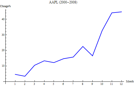
This will give you the monthly change of AAPL in the year of 2008.

monthlychange["AAPL", 2008]

For multiple years, the average seasonality:

mc = monthlychange["AAPL", #] & /@ Range[2000, 2008];

Mean@mc

For APPL, the following graph shows the average seasonality from 2000 – 2008. According to this graph, it is probably a good idea to hold the stock through Oct and Nov before selling it.

seasonality

This is a graph shows the seasonality year by year.

seasonality2

Jul 28, 2009

View stock market with heatmap

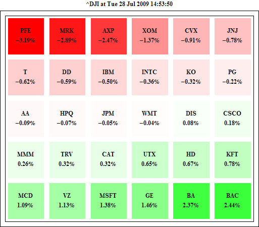
There is a heatmap tool which let you view the stock price change at a glance. It can be recreated with Mathematica in several lines of code.

Let’s pull the data by format {“symbol”, price change}

stockdata={#,(FinancialData[#]/FinancialData[#,"Close"]-1)*100 }& /@FinancialData["^DJI","Members"];

Then we need to represent the price change by color: Green means up, Red mean down, and the deeper the color, the bigger the change.

max = Max[Abs[stockdata[[All, 2]]]]; (* max change *)

GraphicsGrid[Partition[Graphics[{If[#[[2]]>=0.0,Blend[{White,Green},Rescale[#[[2]], {0,max}]], Blend[{Red,White}, Rescale[#[[2]],{-max,0}]]], Rectangle[], Black,Text[Style[#[[1]]<>"\n"<>ToString[NumberForm[#[[2]],{3,2}]]<>"%", Medium,Bold], {0.5,0.5}]}] &/@ stockdata, 6 ]]

The key function is if the price change is >0, then rescale the change in range (0, max) and get it’s color in Blend[{White, Green}]; if the price change is <0, then rescale the change in range (-max, 0) and use Blend[{Red, White}] to get the right color.

HeatMap1

In the ascending order:

HeatMap2

We can try other representations, too. For example, we can use the size of disk to represent the change.

HeatMap3